Footer
What it does
Section titled “What it does”The footer’s Newsletter signup and the in-page Newsletter are persistent signup entries. For an invitation shown according to display frequency, use Marketing popup under Overlays. Footer layout does not control it.
Build a footer from two store menus: a brand introduction, a Shop menu column, a Help menu column, and a text column. Then add signup, contact details, a promotion, or policies if needed. Pages using the main store layout share this footer.
Understand the structure before adding content
Section titled “Understand the structure before adding content”| Editor location | What it controls | Storefront position |
|---|---|---|
| Footer group → Footer | Layout, colors, logo, and brand introduction | The whole footer |
| Footer → Add block → Menu column | One heading and one selected menu | A column such as Shop or Help; select a menu separately for each |
| Content block → Region | Which content row receives the block | Above columns, Main columns, then Below columns |
| Block order within the same region | Which content appears first | Usually left to right on desktop, wrapping as needed; phones also follow order but some blocks remain side by side |
| Content block → Width | How many grid columns it occupies | Works with the column count; does not select its region |
| Policies and localization | Policies and store selectors | A separate utility area after copyright and payment icons |
Unlike Header, Footer content goes directly under Footer. There are no nested Mega menu layout, Left, Center, or Right containers. Region is a setting inside each content block, not another block to add. Change Region to change rows. Dragging a block to the top of the sidebar does not override its assigned row.
Without Brand position, the brand still appears separately: to the left of the main content on desktop and above it on phones. Maximum columns counts the content grid, excluding that separate brand position. A value of 3 can therefore show a brand area plus three content columns.
Screenshots use the real Chinese Shopify navigation with English theme settings: 添加区块 = Add block, 选择 = Select, 替换 = Replace, 保存 = Save. Click an image for full-size settings, then use your browser’s Back button. Signup, brand-positioning, and policy screenshots show the optional steps below; those blocks are not automatically installed.
Add it to a page
Section titled “Add it to a page”1. Prepare two store menus
Section titled “1. Prepare two store menus”A menu is a store resource; Menu column is the theme content block that displays it. Pawglade Main Menu and Footer menu are demonstration-store names, not resources every store receives with the theme.
- In Shopify admin, open Content → Menus and click Create menu.
- Enter Footer Shop in Name. This names the resource in admin; its visible column heading is configured separately.
- Click Add menu item, enter Shop all in Label, and choose All products in Link, or enter /collections/all and press Enter. Click the checkmark to finish that row.
- Add Collections → /collections. Keep both items at the same indentation level. This footer displays only first-level links, not indented children. Click Save.
- Return to the menu list and create Footer Help. Add Search → /search. If you have a contact page, also add Contact us and select that page as the Link. Create and save a page under Online Store → Pages first if necessary; Search alone is enough to start.
- Save the second menu and confirm both resources appear in the list. Two links in a menu do not create two columns: two Menu column blocks will display the two resources.
Reuse existing suitable menus if available. See Shopify’s official menu instructions.
2. Open the shared footer
Section titled “2. Open the shared footer”- Go to Online Store → Themes, find the intended theme, and click Edit theme / Customize.
- In the section sidebar, scroll to Footer group and select Footer. Click the name for settings; click its adjacent arrow to expand its blocks.
- Scroll the page preview to the bottom. The pale Stay in the loop area above the dark Footer is a separate Newsletter section. Do not add footer blocks there.
- If Shop and Help blocks already exist, edit them at the matching steps below. To start with empty content, first duplicate the theme as a backup. In the duplicate, select each existing Footer content block and click Remove block at the bottom of its settings. Keep Footer itself. The default brand remains after removing content blocks; this is expected.
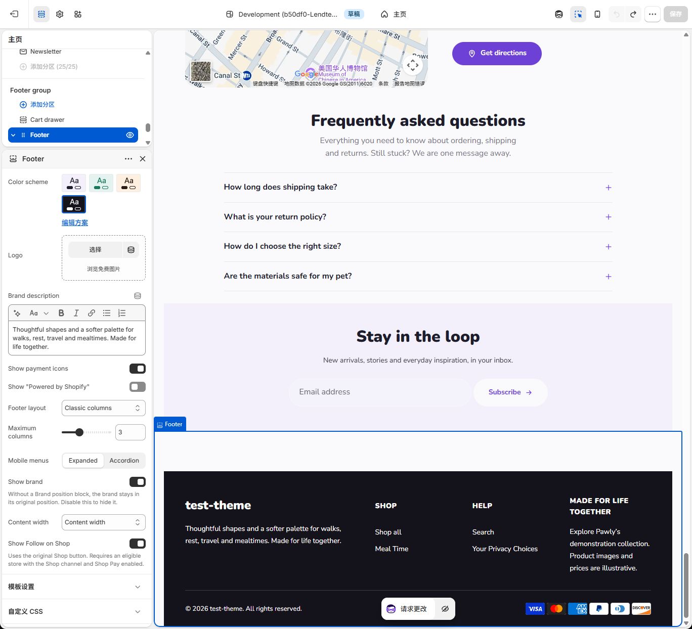
Choose a style
Section titled “Choose a style”| Footer layout | Actual behavior | What you still need to do |
|---|---|---|
| Classic columns | Default columns; Automatic content goes to the main region | Create/select menus and add content |
| Newsletter first | Newsletter signup with Region = Automatic moves above the main region; other Automatic content stays in main | Add Newsletter signup; an explicitly assigned region still wins |
| Brand showcase | A Brand position block with Width = Automatic spans two desktop grid columns | Add Brand position; without it, the separate default brand position remains |
These options work with your content rather than replacing it with a complete new footer. Explicit Above columns, Main columns, or Below columns settings take priority.
Set it up: quick start
Section titled “Set it up: quick start”Step 1: Configure Footer itself
Section titled “Step 1: Configure Footer itself”- Select Footer. Choose Footer layout = Classic columns, Maximum columns = 3, Show brand = On, and Content width = Content width.
- Replace Brand description with accurate copy about your store. For example, describe the everyday activities your products support. Remove any unsupported dates or promises.
- For a logo, click Logo → Select, choose or upload an image in the media picker, and complete the selection. Without an available logo, the actual store name appears. The screenshot says test-theme because no logo was selected; this is not fixed brand text.
- Keep Mobile menus = Expanded for now. The brand introduction should appear; add its neighboring content next.
Step 2: Add the Shop menu column from scratch
Section titled “Step 2: Add the Shop menu column from scratch”- Expand Footer using its adjacent arrow. Click Add block directly under Footer, then choose Menu column. Do not use Add section in Footer group.
- Select the new block and enter Shop in Heading. The sidebar may show Menu column – Shop: type first, heading second.
- In Menu, select Footer Shop. If Footer menu is already selected, click its name → Replace, then search for and click Footer Shop. With no selection, click Select directly. Click outside the list or press Escape to return, and check the selected name.
- Keep Region = Automatic and Width = Automatic. Under Classic columns this goes to the main region. Check for Shop all and Collections beneath Shop.
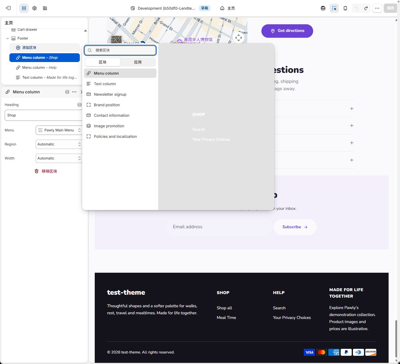
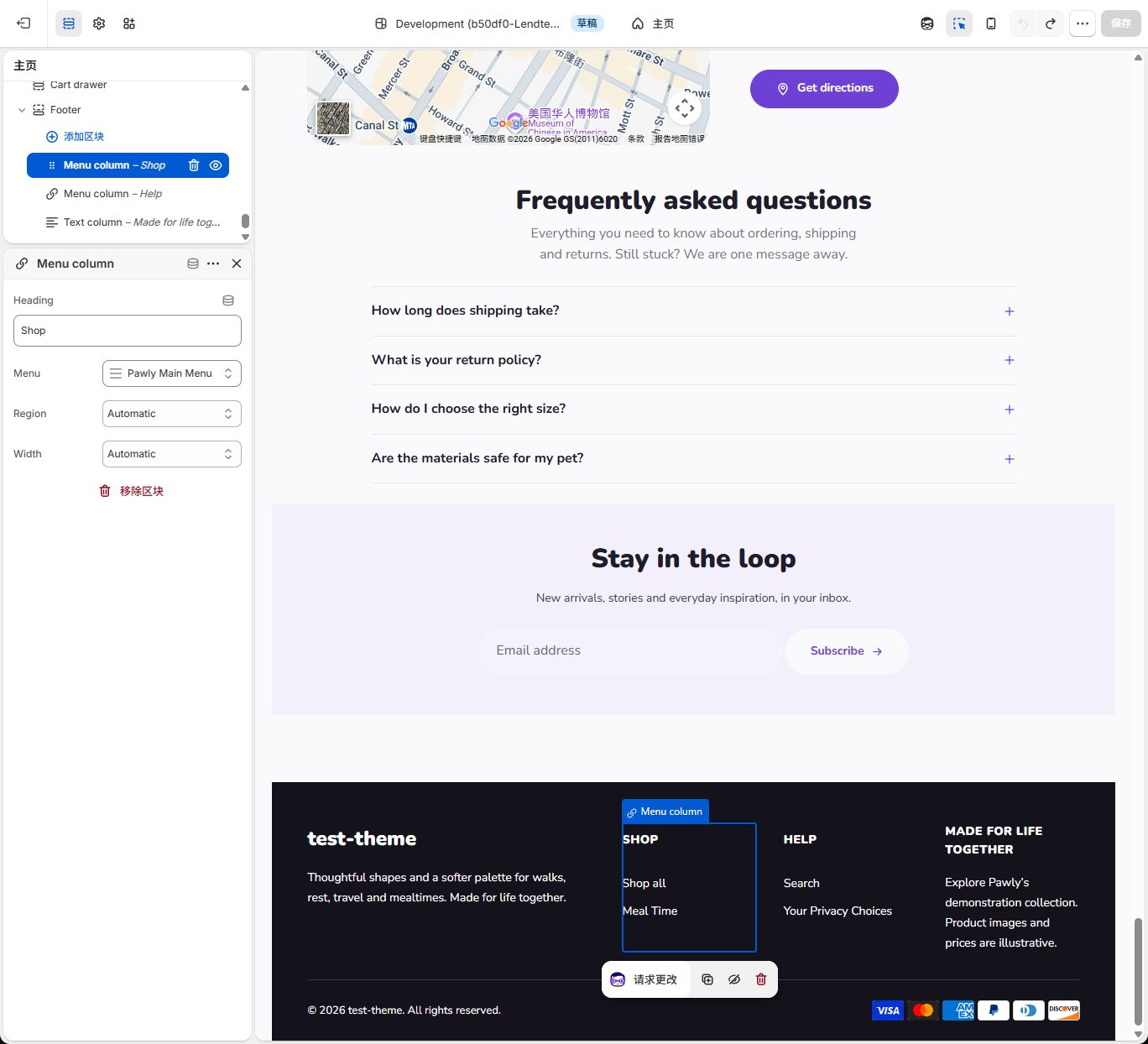
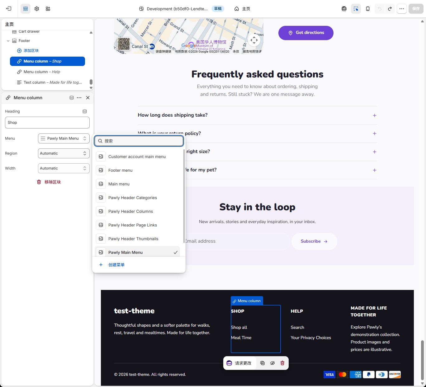
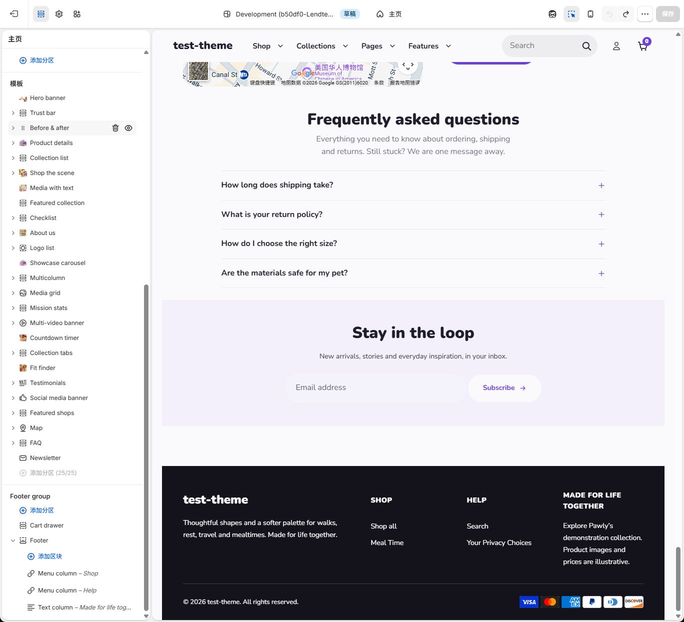
The screenshot uses the demonstration store’s Pawglade Main Menu, showing Shop all and Meal Time. A newly created Footer Shop from this tutorial shows Shop all and Collections instead. Matching headings do not mean matching menu resources: check Menu.
Step 3: Add Help and the text column
Section titled “Step 3: Add Help and the text column”- Return to the block tree and choose Footer → Add block → Menu column again. Enter Help in Heading, select Footer Help in Menu, and keep Region and Width on Automatic. If editing an existing Help column, update it instead of adding a duplicate.
- Choose Footer → Add block → Text column. Set Heading to Made for life together and replace Text with accurate information. The demonstration store explains that its collection, images, and prices are illustrative; use your own store information. Keep Region and Width on Automatic.
- Use the drag handles in the sidebar to order these main-region blocks as Menu column – Shop → Menu column – Help → Text column – Made for life together. Check the actual order after dropping. Dragging does not change a selected menu.
- Select Footer again. On desktop, expect the separate brand on the left and Shop, Help, and the text column to its right. If a column wraps, check for Wide or Full width and confirm Maximum columns = 3; headings do not control placement.
The target is three sibling blocks directly under Footer. No Brand position is needed. This is also the saved demonstration theme structure, with brand copy in Footer itself. Menu links depend on each store’s resources and need not match word for word.
Step 4: Understand Region and Width before moving content
Section titled “Step 4: Understand Region and Width before moving content”| Setting | Desktop effect | Phone effect |
|---|---|---|
| Region = Above columns / Main columns / Below columns | Upper row / main area / lower row | Same region order, with responsive arrangement inside each |
| Region = Automatic | Main by default; signup goes above only under Newsletter first | Same destination rule |
| Width = Normal | One grid column | Ordinary menu or text usually occupies one of two columns |
| Width = Wide | Two grid columns; following content may wrap | Full row |
| Width = Full width | Full row within its region | Full row |
| Width = Automatic | Usually one main-region column; full row above/below; brand can span two in Brand showcase | Brand, signup, and promotion use a full row; menus and ordinary text may remain side by side |
To place text below the menus, select Text column → Region → Below columns, with Width = Full width. Simply dragging it to the bottom of the sidebar is not enough. Restore both fields to Automatic to return to this example.
Step 5: Check phones and save
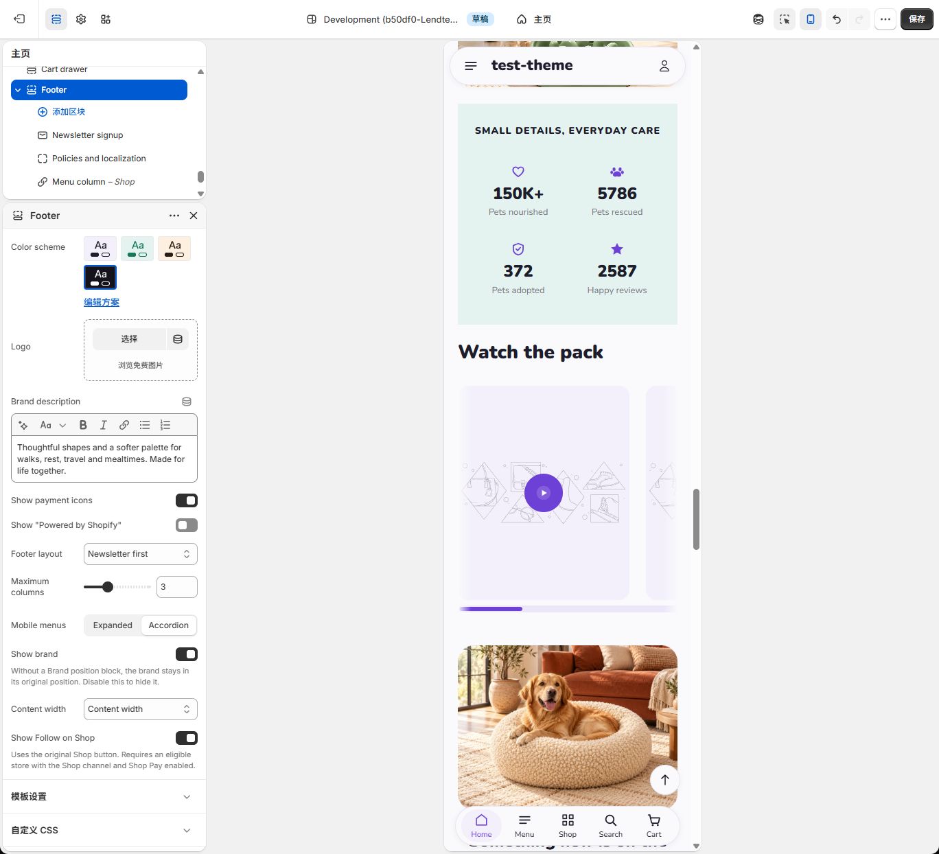
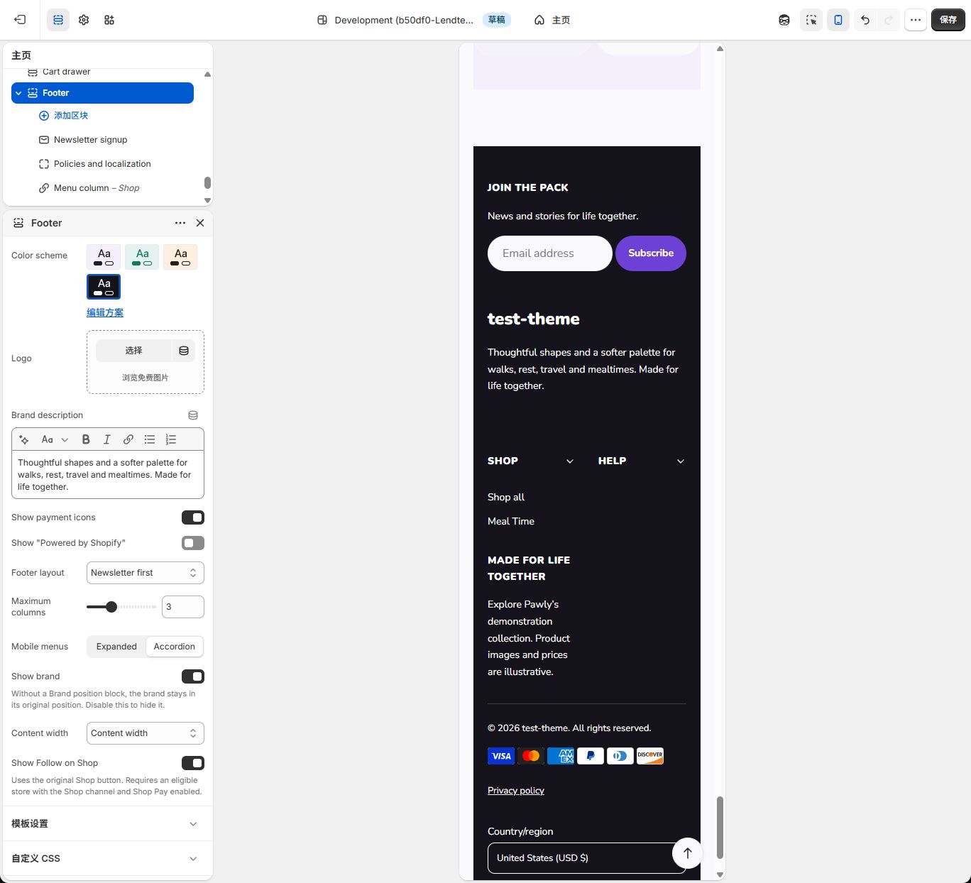
Section titled “Step 5: Check phones and save”- Use the phone icon in the top toolbar. Select Footer and change Mobile menus to Accordion. Shop and Help gain arrows. Only menu columns fold; ordinary text and signup remain visible.
- If clicking a heading selects a block instead, turn off the preview inspector in the toolbar. Click Shop to expand its links, then click again to collapse. The screenshots use a 375 px preview. Shop and Help can still sit side by side; not all footer content becomes a single column.
- Return to desktop and check copy, links, and order. Click Save and wait until the button is disabled. Open the theme preview and verify the footer and link destinations.
These two images also include signup and policies from the optional steps below. At this stage, check Mobile menus and Shop/Help opening and closing.
Settings
Section titled “Settings”| Setting | Default | Options | What it does |
|---|---|---|---|
| Color scheme | scheme-4 | Theme color scheme | Choose a theme color scheme for this area. Check text and link contrast. |
| Logo | Not selected | Image | Choose this area’s logo. Without an available logo, the actual store name appears. The current theme has no global Default logo control. |
| Brand description | Everything your best friend needs, from everyday essentials to special-occasion treats — picked with love and tested by very good boys and girls. | Formatted text | Enter your real brand description. The supplied example is not a claim about your business. |
| Show payment icons | On | On / Off | Show icons for payment types enabled in Shopify. This does not activate payment methods. |
| Show “Powered by Shopify” | Off | On / Off | Show the Powered by Shopify link. |
| Footer layout | Classic columns | Classic columns; Newsletter first; Brand showcase | Choose the footer arrangement; content blocks are added separately. |
| Maximum columns | 3 | 2–5; step 1 | Set the maximum number of content columns on wider screens. |
| Mobile menus | Expanded | Expanded; Accordion | Keep phone menu columns expanded or make them expandable. Newsletter signup stays directly usable. |
| Show brand | On | On / Off | Show the brand area. Removing Brand position alone returns it to the original position rather than hiding it. |
| Content width | Content width | Content width; Full width | Keep content within the normal page width or use the full width. |
| Show Follow on Shop | On | On / Off | Offer Shopify’s original button when the platform provides it; requires an eligible store. |
Show Follow on Shop is on by default in the Footer section. It uses Shopify’s original button and keeps its brand colors. Your store needs the Shop channel and Shop Pay and must qualify for the feature. The switch does not enable those services. Turn it off if you do not want the button; missing platform output is not replaced with a fake button.
Up to 30 content blocks can be added. Newsletter signup, Brand position, and Policies and localization each allow one block.
Blocks
Section titled “Blocks”Use Add block inside the section to add content, then drag content blocks to change their order.
| Block | Limit | What it adds |
|---|---|---|
| Menu column | Multiple; within the section limit | A menu column with an optional heading. |
| Text column | Multiple; within the section limit | A formatted text column. |
| Newsletter signup | 1 | An email signup form for Shopify customer marketing. |
| Brand position | 1 | A placement control for the existing brand area. |
| Contact information | Multiple; within the section limit | Store address, phone, email, and opening hours. |
| Image promotion | Multiple; within the section limit | An image promotion with a link and optional button. |
| Policies and localization | 1 | Store policies, extra policy links, and available language or country selectors. |
Menu column
Section titled “Menu column”| Setting | Default | Options | What it does |
|---|---|---|---|
| Heading | Shop | Text | Enter the heading for this content block. |
| Menu | footer | Store menu | Select a Shopify menu. Only first-level links appear; nested children are not displayed. An empty Heading uses the menu title. |
| Region | Automatic | Automatic; Above columns; Main columns; Below columns | Choose the content area. Automatic follows the selected layout; an explicit region keeps your placement when the layout changes. |
| Width | Automatic | Automatic; Normal; Wide; Full width | Choose how much space this content uses. On phones, widths adapt to the available space. |
Text column
Section titled “Text column”| Setting | Default | Options | What it does |
|---|---|---|---|
| Heading | About | Text | Enter the heading for this content block. |
| Text | We believe every pet deserves the good stuff. Family-run since 2018. | Formatted text | Add your own accurate content. Remove sample text that does not describe your store. |
| Region | Automatic | Automatic; Above columns; Main columns; Below columns | Choose the content area. Automatic follows the selected layout; an explicit region keeps your placement when the layout changes. |
| Width | Automatic | Automatic; Normal; Wide; Full width | Choose how much space this content uses. On phones, widths adapt to the available space. |
Newsletter signup
Section titled “Newsletter signup”| Setting | Default | Options | What it does |
|---|---|---|---|
| Heading | Empty | Text | Leave empty to use the translated newsletter heading. |
| Text | Empty | Formatted text | Leave empty to use the translated newsletter explanation. Do not promise a discount unless your store actually provides it. |
| Button label | Empty | Text | Leave empty to use the translated signup button label. |
| Region | Automatic | Automatic; Above columns; Main columns; Below columns | Choose the content area. Automatic follows the selected layout; an explicit region keeps your placement when the layout changes. |
| Width | Automatic | Automatic; Normal; Wide; Full width | Choose how much space this content uses. On phones, widths adapt to the available space. |
Brand position
Section titled “Brand position”| Setting | Default | Options | What it does |
|---|---|---|---|
| Show social links | On | On / Off | Show social links supplied in Theme settings → Social media. |
| Region | Automatic | Automatic; Above columns; Main columns; Below columns | Choose the content area. Automatic follows the selected layout; an explicit region keeps your placement when the layout changes. |
| Width | Automatic | Automatic; Normal; Wide; Full width | Choose how much space this content uses. On phones, widths adapt to the available space. |
Contact information
Section titled “Contact information”| Setting | Default | Options | What it does |
|---|---|---|---|
| Heading | Empty | Text | Enter the heading for this content block. |
| Address | Empty | Formatted text | Enter the address shoppers should use; it is not automatically copied from Shopify locations. |
| Phone | Empty | Text | Enter your public contact phone number. |
| Empty | Text | Enter your public contact email address. | |
| Opening hours | Empty | Multiple lines | Enter real opening hours, with one line per time period if needed. |
| Region | Automatic | Automatic; Above columns; Main columns; Below columns | Choose the content area. Automatic follows the selected layout; an explicit region keeps your placement when the layout changes. |
| Width | Automatic | Automatic; Normal; Wide; Full width | Choose how much space this content uses. On phones, widths adapt to the available space. |
Image promotion
Section titled “Image promotion”| Setting | Default | Options | What it does |
|---|---|---|---|
| Image | Not selected | Image | Use a clear image at least 800 px wide. Match the selected ratio and keep essential text out of the image. |
| Heading | Empty | Text | Enter the heading for this content block. |
| Text | Empty | Formatted text | Add your own accurate content. Remove sample text that does not describe your store. |
| Link | Not selected | Link | Choose the destination for this content. Check that it opens the intended page. |
| Button label | Empty | Text | Enter the text shown on the button. |
| Card style | Below columns | Below columns; Text over image | Choose whether the text sits below the image or over it. Check contrast when text overlaps the image. |
| Image ratio | Portrait | Square; Portrait; Landscape | Choose the image shape. Check cropping and the focal point after changing it. |
| Region | Automatic | Automatic; Above columns; Main columns; Below columns | Choose the content area. Automatic follows the selected layout; an explicit region keeps your placement when the layout changes. |
| Width | Automatic | Automatic; Normal; Wide; Full width | Choose how much space this content uses. On phones, widths adapt to the available space. |
Policies and localization
Section titled “Policies and localization”| Setting | Default | Options | What it does |
|---|---|---|---|
| Show store policies | On | On / Off | Show policies that have real content in your Shopify policy settings. |
| Additional policy menu | Not selected | Store menu | Add links from another menu. Repeated destinations are shown once. |
| Show language selector | On | On / Off | Show the language selector only when more than one storefront language is available. |
| Show country/region selector | On | On / Off | Show the country/region selector only when more than one country is available. |
| Alignment | Left | Left; Center | Align this policy and selector area to the left or center. |
Images and content tips
Section titled “Images and content tips”Header and Footer can select separate logos. See Logo and brand images for each location’s selection. Enter public social URLs under Theme settings → Social media; adding Brand position does not create account links.
For Image promotion, use an image at least 800 px wide, matching the chosen ratio. Keep important words in Heading/Text. Click Select to choose or upload an image and complete the selection; use the current image’s control to replace it. Check cropping after changing Image ratio.
Good to know
Section titled “Good to know”- Independent resources: Editing a menu under Content → Menus changes every place using that resource. Changing a block’s Heading does not rename its menu.
- Empty content: A menu without first-level links is hidden. A text block can display a heading alone. Contact information needs at least an address, phone, email, or opening hours; Heading alone is hidden. Image promotion needs an image, heading, or text; Link alone is hidden. Without Link, no promotion link appears.
- Brand: Brand position moves the existing brand, rather than copying it. Deleting the block restores its default position; turn off Footer → Show brand to hide it. Logo and Brand description remain in Footer settings.
- Countries and languages: Switches do not create store resources. Each control needs multiple available options. Countries are not an arbitrary currency list; market configuration determines the currency displayed. Shoppers select an option and click Update.
- Signup: Collecting an email and sending messages are separate operations. The theme does not automatically send a welcome email, create discounts, or guarantee delivery. Configure marketing separately in Shopify. Default copy promises no discount.
- Without browser scripting: Links, signup, and localization forms remain available; phone menus stay expanded.
Example setups
Section titled “Example setups”Optional A: Policies and store selectors
Section titled “Optional A: Policies and store selectors”- First edit and save actual policies under Settings → Policies. The theme does not write policies or list policies with no content.
- If you need additional help links, create an additional menu under Content → Menus using the earlier steps. Otherwise leave it empty.
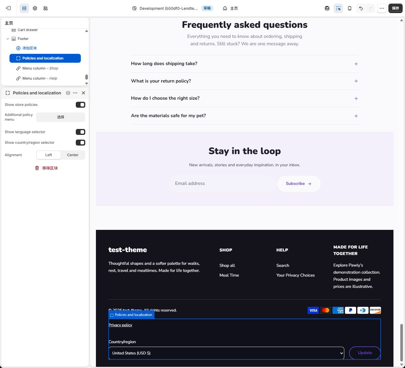
- Choose Footer → Add block → Policies and localization. Keep Show store policies on, select the additional menu if needed, and choose Alignment = Left. Only one is allowed. It always uses the bottom utility area and has no Region or Width setting.
- For languages, first add and publish the required language under Settings → Languages and check its market availability. For countries, check the intended markets and storefront countries under Markets. Do not enable markets you do not intend to serve just for a screenshot. See Shopify’s language guidance.
- Turn on Show language selector and Show country/region selector, then check the bottom preview. This store has Canada and United States, so the country control appears. Only one language is available, so the screenshot has no language selector. This is an unmet condition, not a broken block.
- After saving, choose a configured option in the actual preview, click Update, and check the result. This may affect language, pricing, and market presentation; verify against your own business setup.
Optional B: Newsletter first
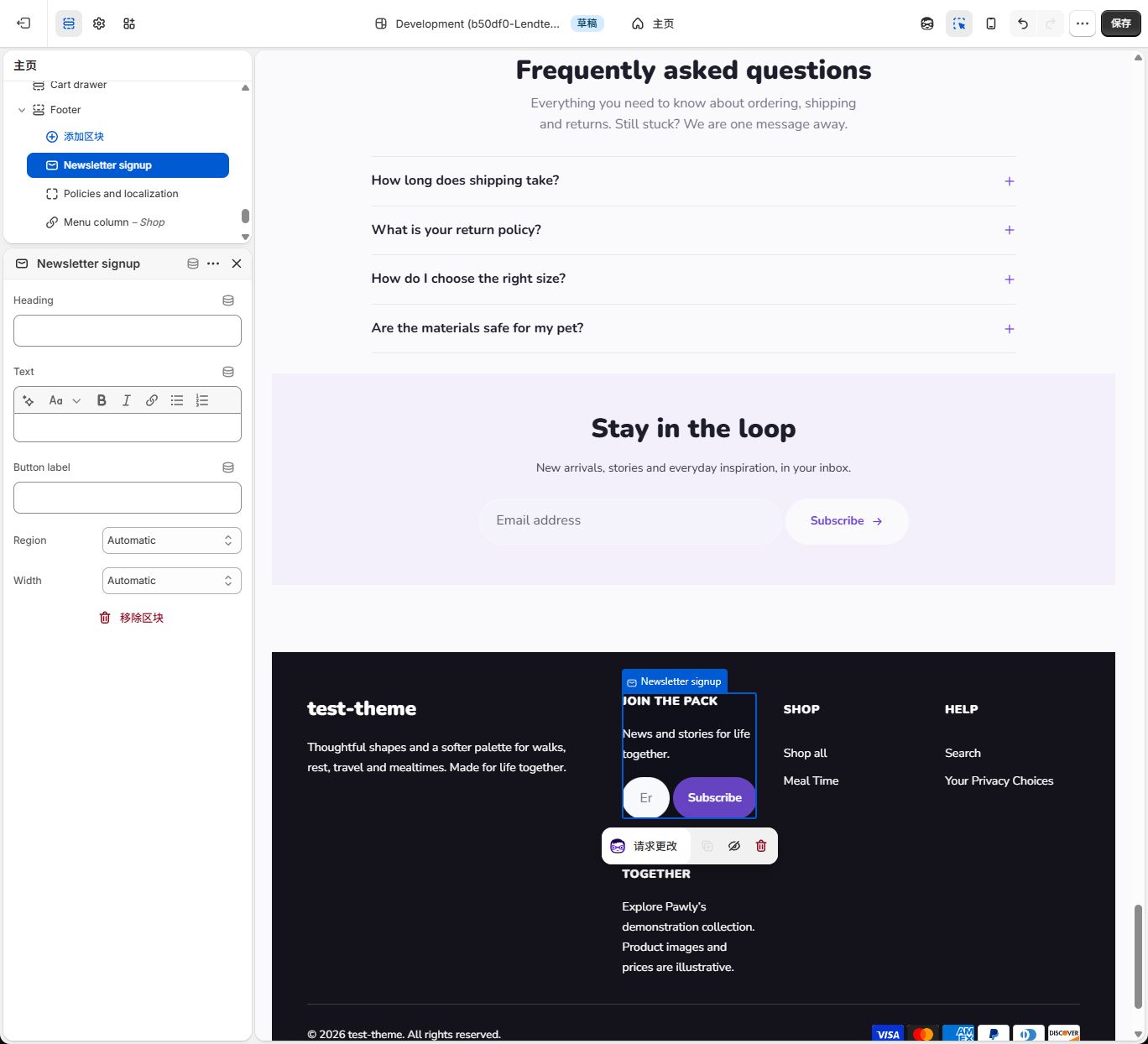
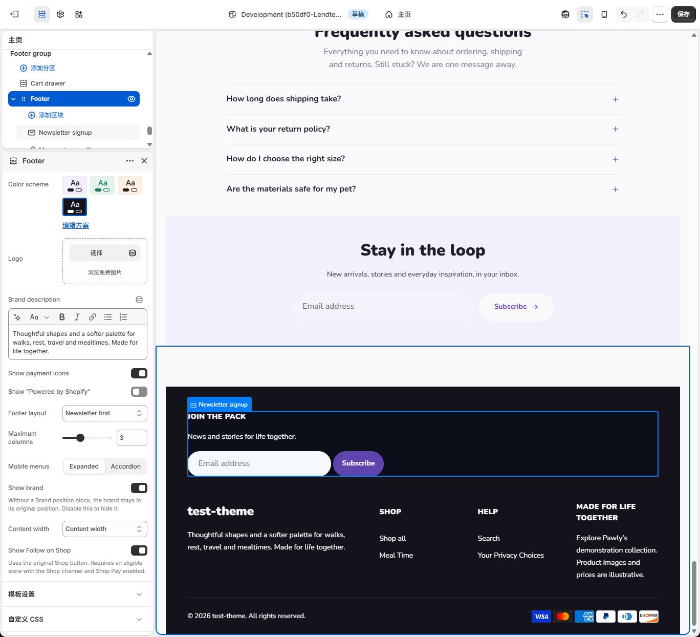
Section titled “Optional B: Newsletter first”- Choose Footer → Add block → Newsletter signup; only one is allowed. Heading, Text, and Button label start empty and use translated defaults such as Join the pack and Subscribe. Replace them with your own accurate copy if needed.
- Keep Region = Automatic and Width = Automatic. Select Footer and choose Newsletter first. The form moves above the brand and menus, filling the upper row.
- If it does not move, check the signup block’s Region. Explicit Main columns/Below columns are not overridden. Do not confuse the separate Newsletter section with this form.
- Check the phone input and button, then save. To verify submission, use your own accessible test email and follow your actual consent rules. Form success does not prove a marketing message was sent.
Optional C: Move the brand above the content
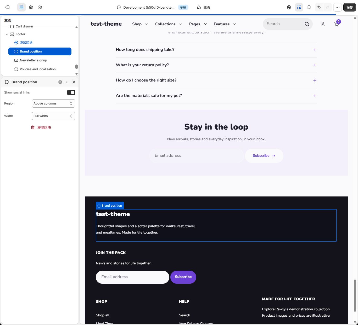
Section titled “Optional C: Move the brand above the content”- Choose Footer → Add block → Brand position. It has no Logo upload field: brand content remains in Footer settings.
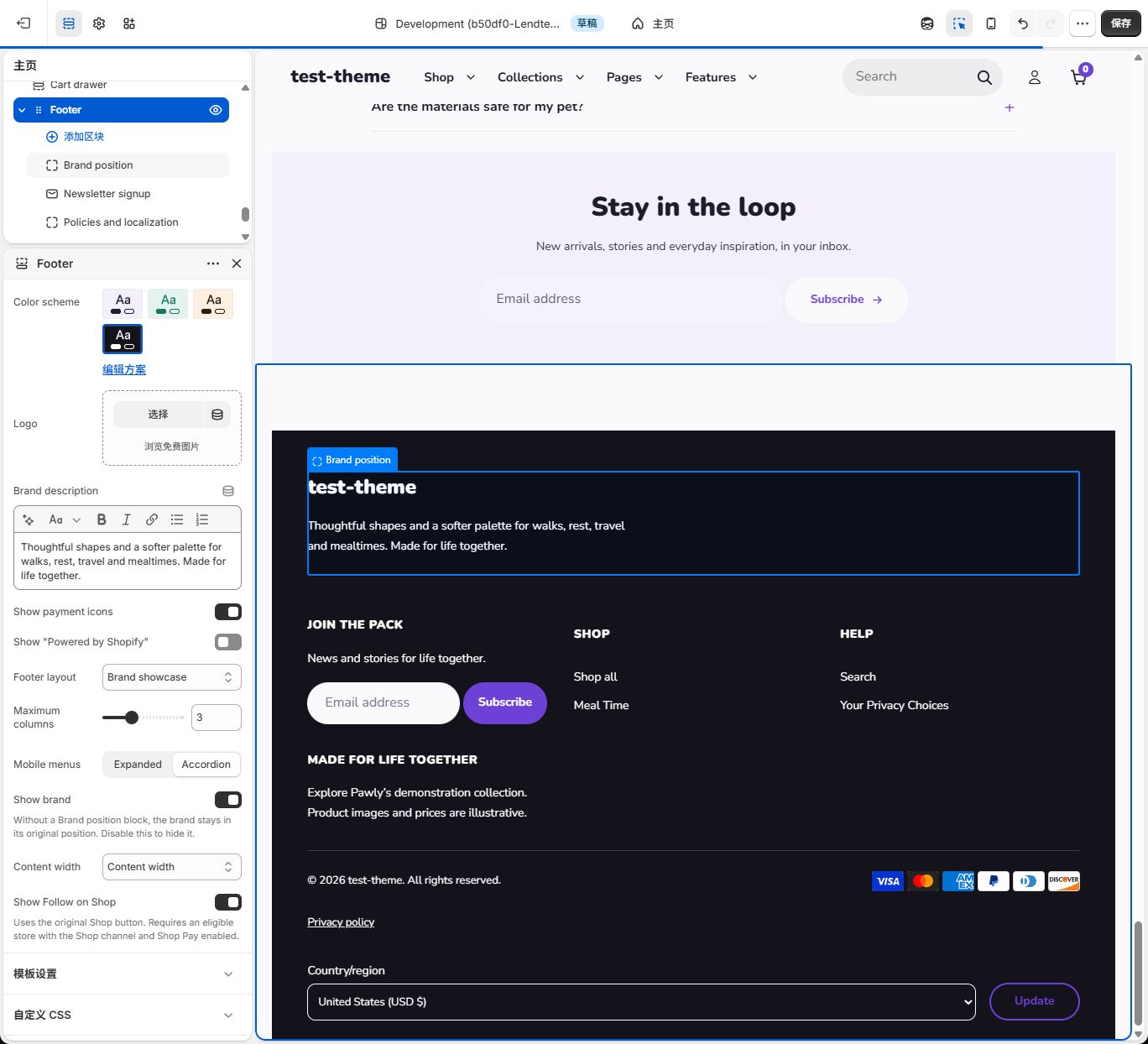
- Choose Region = Above columns, Width = Full width. The existing brand moves to the upper row. Show social links controls globally configured URLs.
- Select Footer and choose Brand showcase. The explicit full row remains. To see the automatic two-column brand instead, set the brand block to Main columns and Width = Automatic, with Maximum columns at least 2.
- Delete Brand position to restore the default position. To remove the brand entirely, turn off Footer → Show brand. Check desktop and phone, then save.
Optional D: Contact details or an image promotion
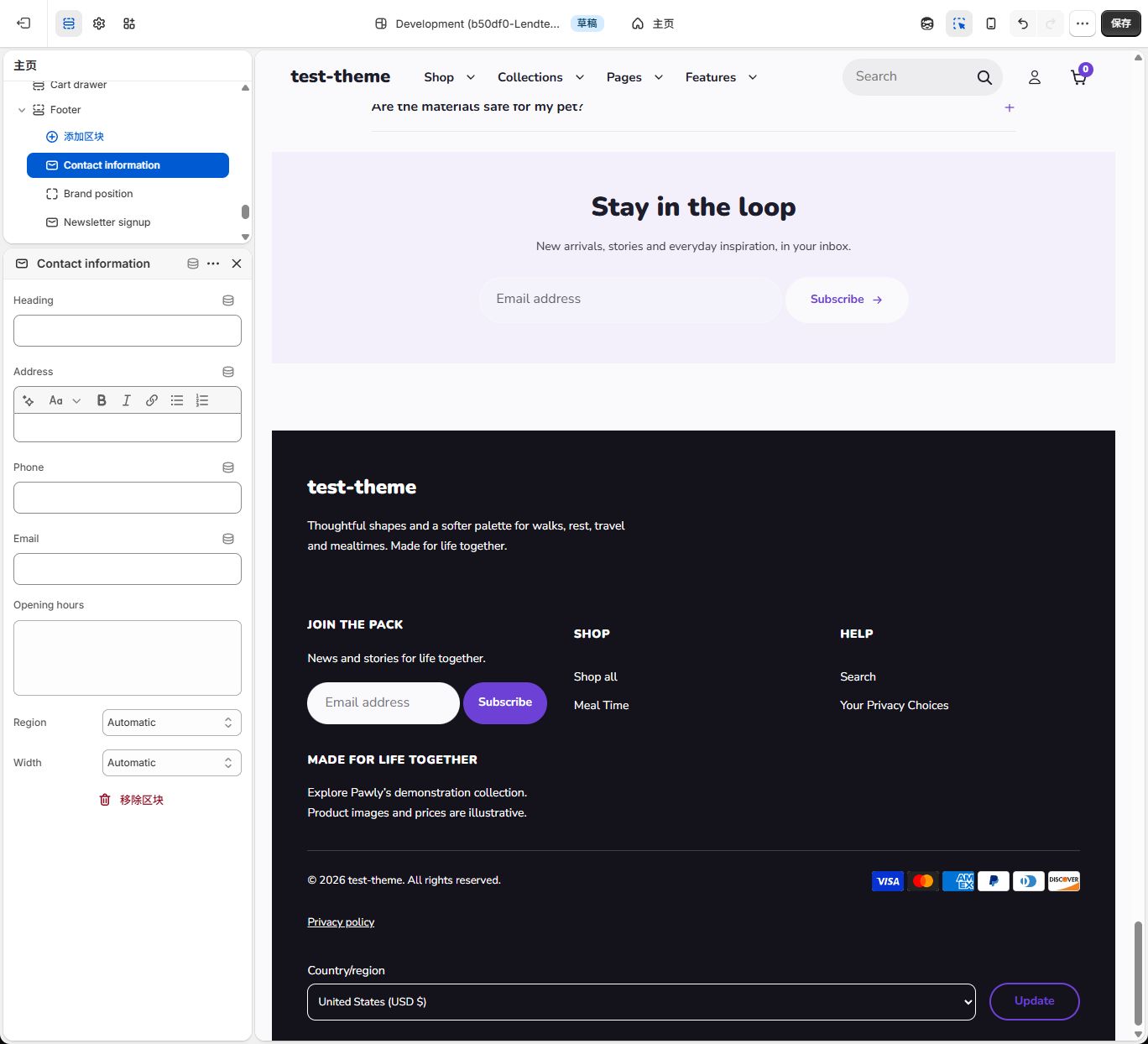
Section titled “Optional D: Contact details or an image promotion”Contact: Choose Footer → Add block → Contact information. Set Heading to Contact us and enter at least one accurate public Address, Phone, Email, or Opening hours. Choose Region = Main columns and Width = Normal. Store locations and support email are not copied automatically. Heading alone stays hidden; this screenshot shows the unfilled settings. Check phone/email links after filling them and save.
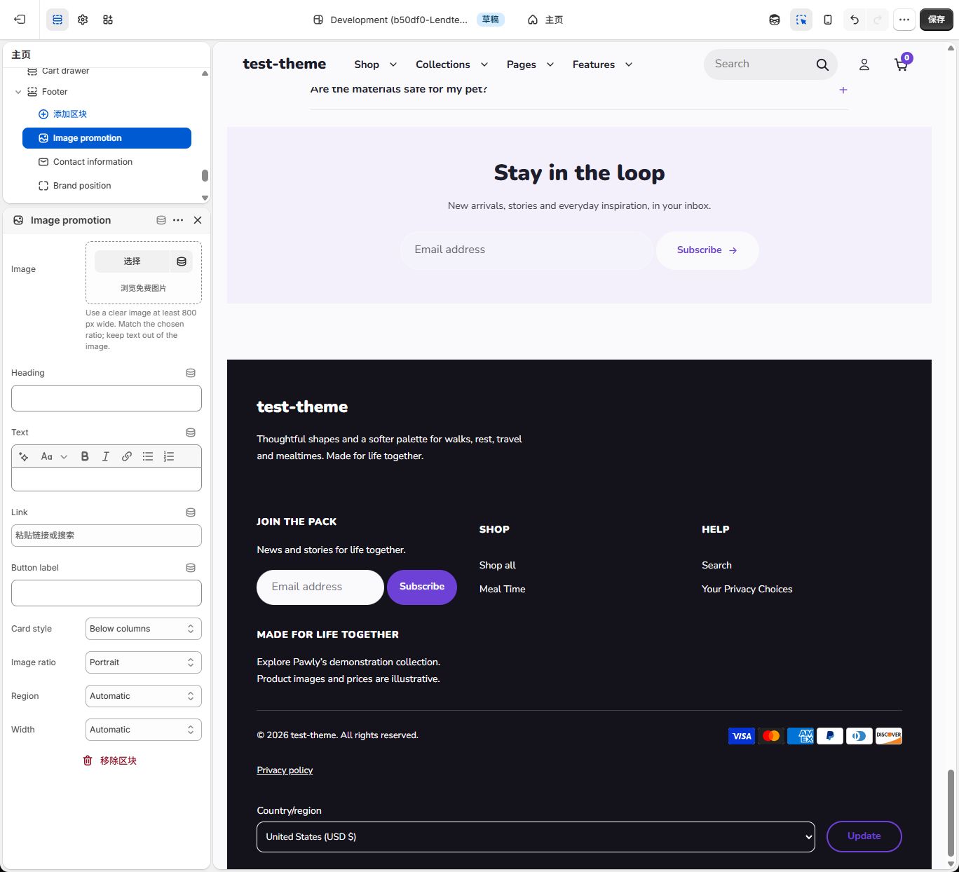
Promotion: Choose Footer → Add block → Image promotion. Select or upload Image, fill Heading and Text, select a real collection or page in Link, and use View collection for Button label. Choose Card style = Below columns (copy below image) or Text over image, Image ratio = Portrait, Region = Below columns, Width = Full width. Card style’s Below columns describes copy relative to the image; Region’s identically named choice selects a footer row. This screenshot shows the new unfilled block, not a final image card. Add at least an image, heading, or text, check the preview, and save.
Common questions
Section titled “Common questions”Why is a block missing from Add block? Use Add block inside Footer. Newsletter signup, Brand position, and Policies and localization each allow one instance; find and edit the existing instance. Footer allows 30 blocks in total and does not need Header region blocks.
Why is a menu column absent? Check the selected Menu resource, its first-level links, and the block’s visibility in that order. A new block may select Footer menu by default; confirm your intended resource. Changing Heading does not change Menu. Move nested links to the first level if you want them here.
Why did dragging not change rows? Check Region, then order within that region, then Width and column count for wrapping. Policies and localization always stays in the utility area.
Why is the language control absent? Confirm Policies and localization exists and is visible, then check its switch, published languages, and market availability. One option means no selector. Countries follow the same principle; two enabled switches do not guarantee two visible controls.
Why does changing layouts do little? Newsletter first needs Newsletter signup with Region = Automatic. Brand showcase’s automatic two-column treatment needs Brand position with Width = Automatic. Explicit placement takes priority, and switching layouts does not add missing content.
Why does my saved result differ from the screenshots? Confirm that you are previewing the saved theme, then check menu resources, block order, Region, Width, logo fallback, and phone settings. Demonstration resources are not bundled store data. Unsaved temporary edits do not become store configuration.
Why are payment icons or Follow on Shop absent? Icons depend on enabled payment types; Follow on Shop depends on Shopify providing the native feature for the store. Display switches do not enable those services. Do not add an imitation button.