Gift card
What it does
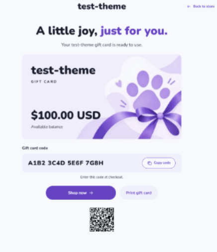
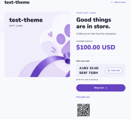
Section titled “What it does”Gift card styles the redemption page for a gift card already issued by Shopify. It displays the real balance, code, expiry information, and card status. It does not create a gift-card product or set its price. Configure the separate recipient purchase form in Product.
Add it to a page
Section titled “Add it to a page”- In Shopify admin, open Online Store → Themes and open the theme editor for the theme you want to change.
- In the template selector, open Others → Gift card.
- Select Gift card in the sidebar and edit its settings.
- Save and check the issued-card page using a test card.
This is a dedicated page with its own controls, rather than a section to add to a regular page template. The store’s normal Header and Footer are not used here. Shopify describes gift card appearance under templates.
Choose a style
Section titled “Choose a style”| Layout | Appearance |
|---|---|
| Centered gift card | Centered introduction, landscape card, balance, and redemption information |
| Image and details | Image on the left and redemption details on the right; stacked on phones |
The same selected image and entered text are kept when you switch layouts. With no image, the card uses Card tint. Switching the layout does not generate card data.
Set it up: quick start
Section titled “Set it up: quick start”- Choose Centered gift card for Layout.
- Upload a Logo and a suitable Card background / left main image, or use the plain card color.
- Leave Heading and Subheading empty to use the translated defaults.
- Keep Show QR code, Show print button, and Show Apple Wallet on.
- Check a test card’s balance and code, then test copying and printing in the browsers your shoppers use.
Settings
Section titled “Settings”| Setting | Default | Options | What it does |
|---|---|---|---|
| Layout | Centered gift card | Centered gift card; Image and details | Choose a centered landscape card or an image beside the details. |
| Maximum page width | 1280 px | 960–1440 px; step 40 | Set the maximum page content width. The centered card itself stays narrower than the page. |
| Space above content | 48 px | 16–120 px; step 8 | Set space above the content. Phone spacing is capped at 40 px. |
| Bottom spacing | 48 px | 16–120 px; step 8 | Set space below the content. |
| Logo | Not selected | Image | Choose a page logo. Without an available logo, the actual store name appears. The current theme has no global Default logo control. Recommended: 600 × 200 px transparent PNG or WebP. |
| Logo width | 160 px | 80–240 px; step 10 | Set the logo image width. Smaller screens may reduce it to keep the other controls usable. |
| Show logo and card label on the image | On | On / Off | Overlay the logo or store name and gift-card label on the card image. Turn off when your artwork already includes them. |
| Show image branding on mobile | Off | On / Off | Image and details only: show image branding on phones. Also requires the main branding switch. With no image, the plain card retains branding when the main switch is on. |
| Heading | Empty | Formatted heading | Leave empty for the layout’s translated default. Italic heading text uses the theme accent color. Unavailable cards use a neutral default heading. |
| Desktop heading size | 64 px | 32–72 px; step 2 | Set the desktop heading size; the heading adapts on phones. |
| Subheading | Empty | Text | Leave empty for the layout’s translated default. Use Show subheading to hide it instead. |
| Show subheading | On | On / Off | Show the subheading for an active card. It is omitted for unavailable or inactive states. |
| Image caption | Empty | Text | Add a caption below the image in Image and details only. |
| Copy button label | Empty | Text | Override the translated copy-button text. Empty uses the translated default. |
| Shop button label | Empty | Text | Override the shop-button text. Its destination stays your store homepage. |
| Background color | Empty | Color | Override this page’s background. Empty uses the theme background. |
| Left background image | Not selected | Image | Add optional left-side decoration. Use an 800 × 800 px transparent PNG or WebP and keep essential text out of it. |
| Right background image | Not selected | Image | Add optional right-side decoration. Use an 800 × 800 px transparent PNG or WebP and keep essential text out of it. |
| Background image width | 380 px | 160–600 px; step 20 | Set the target decorative image width; screen space can limit the actual size. |
| Background image opacity | 45 % | 0–100 %; step 5 | Fade both decorative background images without fading the redemption information. |
| Show background images on mobile | Off | On / Off | Show the decorative background images on phones. They are hidden there by default. |
| Card background / left main image | Not selected | Image | Centered: use about 1500 × 800 px with clear text space on the left. Image and details: use about 1200 × 1200 px. Set the focal point to control cropping. |
| Card tint | Lilac | Cream; Lilac; Mint; Apricot | Set the plain card color and the color used for its image overlay. |
| Text color on image | Empty | Color | Override the store-name fallback, card label, and centered balance color over the image. It does not recolor an uploaded logo. |
| Image tint overlay | 0 % | 0–100 %; step 5 | Add the selected card color over the image to improve text contrast. |
| Image fit | Fill and crop | Fill and crop; Fit entire image | Fill and crop fills the image area; Fit entire image keeps the full image with space around it when needed. |
| Desktop image ratio | Square (1:1) | Square (1:1); Portrait (4:5); Tall (3:4); Landscape (3:2) | Set the desktop image shape in Image and details only. Centered gift card keeps its landscape shape. |
| Mobile image ratio | Landscape (4:3) | Square (1:1); Portrait (4:5); Tall (3:4); Landscape (3:2); Landscape (4:3) | Set the phone image shape in Image and details only. Existing saved choices stay unchanged when the theme’s default changes. |
| Show back to store link | On | On / Off | Show the header link back to your store. |
| Show print button | On | On / Off | Show a print button when the browser controls are ready. Browser printing can also be used directly. |
| Show QR code | On | On / Off | Show a QR code only for an active card when Shopify supplies the required card information. |
| Show Apple Wallet | On | On / Off | Show Apple Wallet only for an active card with a Wallet pass supplied by Shopify. |
| Show gift message | On | On / Off | Show a real sender message when one is included with the issued card. |
| Show original value when balance changes | On | On / Off | Show the original value only when it differs from the remaining balance. |
Images and content tips
Section titled “Images and content tips”Do not place a balance, redemption code, QR code, or recipient’s private information inside the artwork. Shopify supplies the real card data separately. Choose a photo with enough clear space for overlaid text and check contrast at both screen sizes.
Text color on image changes text, not the colors inside your uploaded logo. Use a suitable logo variant when needed. Background decorations should remain decorative and should not carry important instructions.
When taking documentation screenshots, use test data and hide the actual redemption code and QR code.
Good to know
Section titled “Good to know”- The page distinguishes unavailable, disabled, expired, fully used, and active cards. Balance, original value, expiry, and message come from the issued card, not editable sample fields.
- Copying, redemption instructions, QR, and Wallet are offered for active cards when their required data is present. Enabling a switch does not create missing data or reactivate a card.
- A changed balance can show the original value as additional information. It does not replace the remaining balance.
- Copying can be blocked by browser permissions. The page helps the shopper select the code for manual copying instead.
- Printing uses the browser’s print dialog. Decoration and screen-only actions are removed from the print view; check paper layout in the target browser.
- Without browser scripting, card text and the store link remain available. Use the browser’s own print command; interactive copy and generated QR controls are unavailable.
- A scheduled send date is displayed when Shopify supplies it with the issued card. Configure recipient details and delivery scheduling in the Product purchase form, not in these appearance settings.
Example setups
Section titled “Example setups”Minimal card: choose Centered gift card, use Card tint → Lilac, leave the card image empty, and keep both decorative background images empty. Leave default heading text and redemption functions enabled.
Image-led gift: choose Image and details, upload a 1200 × 1200 px image, use Desktop image ratio → Square (1:1) and Mobile image ratio → Landscape (4:3). Leave Show image branding on mobile off to keep the phone image clear.
Common questions
Section titled “Common questions”Why is Apple Wallet missing even though it is enabled? Shopify must supply a Wallet pass for an active card. The switch alone cannot produce one.
Why does the preview not show a card balance or code? The page needs real card data. A missing card does not create a sample balance or redemption code.
Can I change the card’s value here? No. The theme only displays Shopify’s current card data.
Where do I configure a gift-card recipient form? This page is the issued card’s redemption view. Enable Show gift card recipient form in the Product section’s Buy buttons content block to offer recipient details and a send date.