Header
What it does
Section titled “What it does”Build four top navigation items from scratch: Shop, Collections, Pages and Features. Start with Shop, which combines category links on the left, thumbnail links in the center and three products on the right. Then build the other three layouts.
Understand the editor before starting
Section titled “Understand the editor before starting”Header is the section. Menu panels, regions and content inside it are blocks. Use Add block inside Header, rather than Add section, to create a menu panel.
| Editor location | What it controls | How it maps to the page |
|---|---|---|
| Header → Menu | Top navigation labels and their order | The selected Shopify menu supplies Shop, Collections, Pages and Features |
| A menu panel inside Header | The content opened under one top item | Top-level menu name = Shop associates it with Shop, regardless of panel position in the sidebar |
| Left, Center and Right inside a panel | Groups of content | Sidebar order becomes left to right on desktop and top to bottom on mobile |
| Content inside a region | Links, thumbnails, text, image cards or products | It belongs to the region containing it in the sidebar |
| Menu inside a content block | The links used by that content | Choose this separately; it does not inherit Header’s Menu |
The Region setting identifies a region for styling such as Wider region. Changing that setting does not move the block. Drag regions to change their actual order. Content inside a region also follows its order and can wrap when space is limited.
Screenshots show the real Chinese Shopify interface with English theme setting names. 添加区块 = Add block, 保存 = Save, 选择 = Select. Follow the hierarchy and the English setting labels shown in each image. Click a screenshot to view it at full size, then use your browser’s Back action to continue.
Add it to a page
Section titled “Add it to a page”1. Prepare products, collections, pages and images
Section titled “1. Prepare products, collections, pages and images”- In Products, check that products have titles, prices and main images and are available to Online Store. To create one, click Add product, enter these details, make it available and save. Prepare at least three products for the product area. Thumbnail links can reuse them.
- Create categories in Products → Collections. Name each collection, add its products and save. Walk, Rest, Travel and Meal Time are example store collections; use your own categories.
- Create any required page in Online Store → Pages and save it. You can use an existing contact page or use an actual collection as a temporary target if you do not have that page yet.
- Prepare images at least 800 px wide for promotion cards. Upload them in Content → Files, or upload from the card’s Image picker. Thumbnail links use the linked product’s main image; you do not upload each thumbnail in that block.
Choosing a menu layout does not create store resources. The Pawglade menus and products below are examples. Create or select your own actual resources when the example names are unavailable.
2. Create the top navigation menu
Section titled “2. Create the top navigation menu”- Leave the theme editor and open Content → Menus → Create menu.
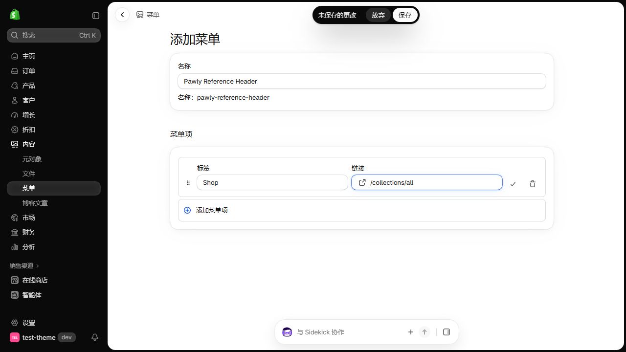
- Enter Pawglade Reference Header in Name. This is the menu’s name in the admin, not the Shop label displayed to customers.
- Click Add menu item, enter Shop in Label, then click Link. Choose a real resource, or enter /collections/all and press Enter for this example. Click the checkmark on that row to finish editing the item.
- Add the other three top items below. Keep them at the same indentation level. Drag their handles to order them Shop → Collections → Pages → Features.
- Click Save, return to the menu list and confirm that the menu and four top items are present.
| Label | Example Link | Destination |
|---|---|---|
| Shop | /collections/all | All products |
| Collections | /collections | Collection list |
| Pages | Select your saved contact page; example /pages/contact | Use the actual page address in your store |
| Features | /search | Search; add nested links below it later |
3. Add nested links and create four content menus
Section titled “3. Add nested links and create four content menus”To add a nested item, use Add menu item, enter Label, choose Link and finish the row. Drag it below its parent and indent it to the right. To create a third level, indent it below a second-level parent. Confirm the indentation before saving. Drag left to return an item to the parent level.
Under Features in the main menu, add Collections, Product Gallery and Search. Link Collections to /collections and nest Walk, Rest and Travel below it. Link Product Gallery to /collections/all and nest three actual products below it. Link Search to /search without children. Only the first two have further expand arrows. You may also add nested links under Shop, Collections and Pages as fallback navigation when no custom panel content is available.
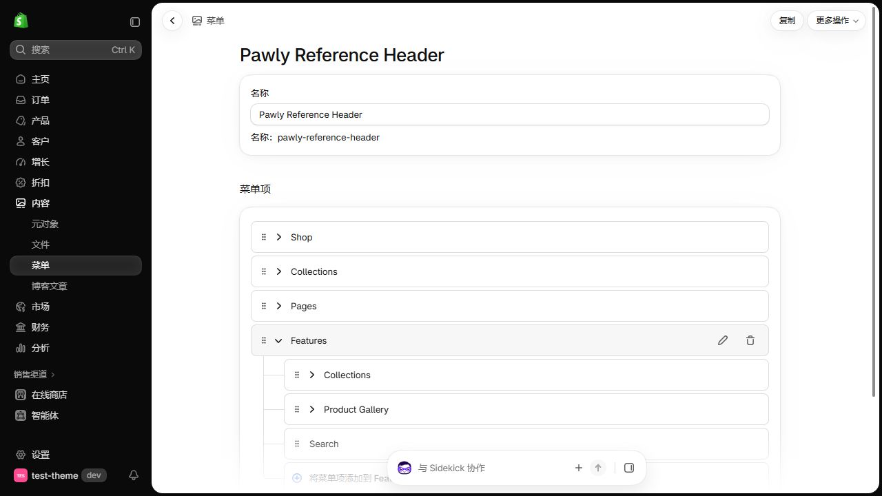
Return to Content → Menus and use Create menu to create each menu below. Add its links and save each menu. These supply content inside the dropdown panels; they do not each add another top navigation item.
| Menu Name | Content to add | Where it will be selected |
|---|---|---|
| Pawglade Header Categories | Walk, Rest, Travel and Meal Time linked to real collections; Shop all linked to /collections/all; all at one level | Shop → Left → Category navigation → Menu |
| Pawglade Header Thumbnails | Six product links: Everyday Carrier, Everyday Harness, Cloud Curl Bed, Slow Sunday Bowl, Daily Cat Food and Daily Dog Food in the example; all at one level | Shop → Center → Thumbnail links → Menu |
| Pawglade Header Columns | For dogs with Walk / Rest / Travel; For cats with Play / Rest / Travel; Meal Time with Pet food / Slow Sunday Bowl; choose actual resources for headings and children | Collections → Left → Menu columns → Menu |
| Pawglade Header Page Links | Contact us linked to your contact page; Shop all to /collections/all; Search to /search; all at one level | Pages → Right → Menu columns → Menu |
Checkpoint: The menu list contains one main menu and four content menus. Open each and check its name, indentation and links. For thumbnails, choose actual resources from Products or Collections in the link picker. A page or manually entered web address does not guarantee a resource image.
4. Open Header and choose the main menu
Section titled “4. Open Header and choose the main menu”- Open Online Store → Themes → Edit theme for the theme you are setting up.
- Under Header group, click the Header name to open its settings. Click the arrow beside the name to expand its children. These are different actions.
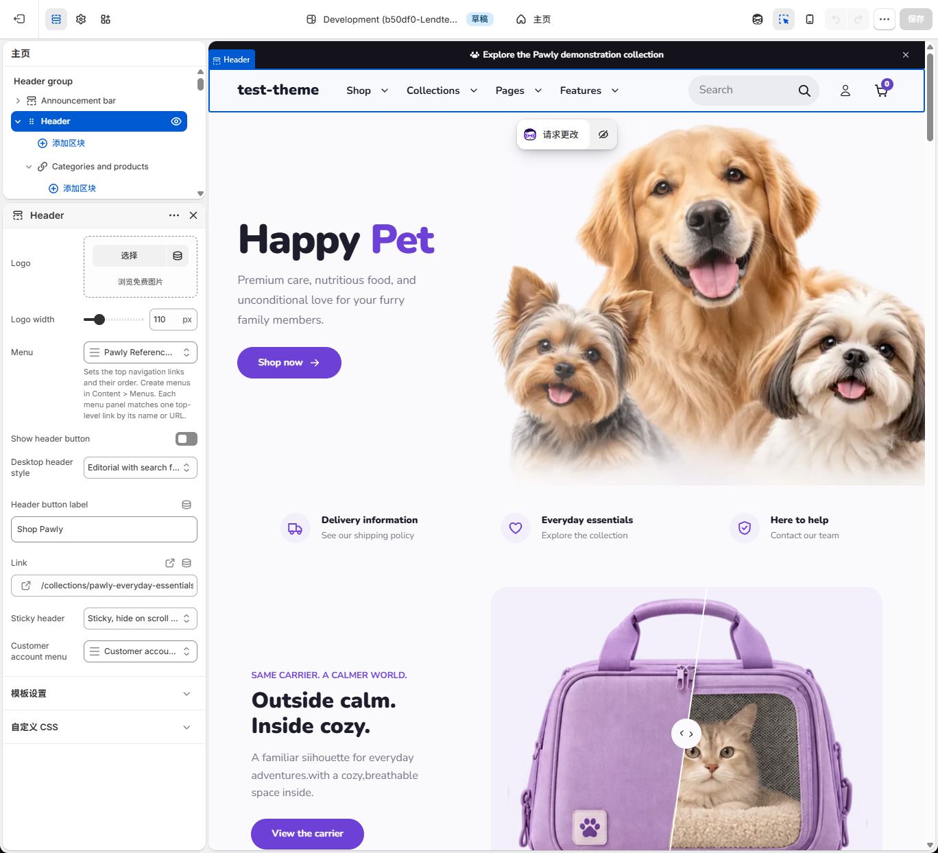
- In Header’s Menu, click the current menu or selection control, search for Pawglade Reference Header and select it. If a menu action popup opens first, choose the action to change the menu before searching.
- Set Desktop header style = Editorial with search field, turn off Show header button, and set Logo width = 110 px. Choose your own Logo image, or leave it empty to use the global logo or actual store name.
- Click Save. Check that Shop, Collections, Pages and Features appear in order. Custom panel content has not been added yet.
If these four example panels already exist, practice on a theme copy: choose Duplicate from the theme’s action menu, open the copy, select each example panel and use Remove block at the bottom of its settings, then save. Keep Header itself. The steps below begin without those panels. To inspect a configured example, expand the existing panel instead. Do not keep two panels matching the same Shop item; only the first matching panel is used.
Choose a style
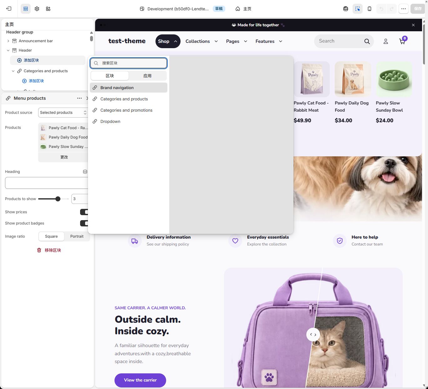
Section titled “Choose a style”Choose one of these items from Header’s own Add block. They are four starting combinations for a menu panel. The current theme uses the same short names before and after adding them.
| Add option / panel name after adding | Included regions and content | Top item used here |
|---|---|---|
| Categories and products | Left → Category navigation; Right → Menu products | Shop |
| Categories and promotions | Left → Menu columns; Right → Menu image card | Collections |
| Brand navigation | Left → Menu text; Center → Menu image card | Pages |
| Dropdown | Compact links; no content regions required | Features |
An older configuration may show Mega menu layout, the generic name for this panel type. It is not another section you need to find or add. Inspect Top-level menu name and Menu layout to identify it. The current demonstration configuration uses the names above; older or custom-named instances do not necessarily rename themselves.
Set it up: quick start
Section titled “Set it up: quick start”How to use the selection controls
Section titled “How to use the selection controls”- Replace an existing Menu: Click its current menu name, choose Replace, then search for and click the intended menu. With no selection, click Select to open the list directly. Check the new menu name in the setting before saving the theme. This applies separately to Menu in Header, Category navigation, Menu columns and Thumbnail links.
- Select multiple products: Open Products, check the required products, then click outside the list or press Escape to return. The current interface updates the selection directly; there is no extra confirmation button to find. Check the selected product list, then click the theme’s Save.
- Choose images and links: Use Image to select or upload media and finish the media selection. Link can select actual store resources. Check the destination after replacing it, rather than changing only the heading.
- Identify content blocks: Sidebar titles can append the selected menu or heading, such as Thumbnail links – Pawglade Header Thumbnails or Menu text – Explore our store. The first part is the content block name used in this guide.
Step 1: Add and associate the Shop panel
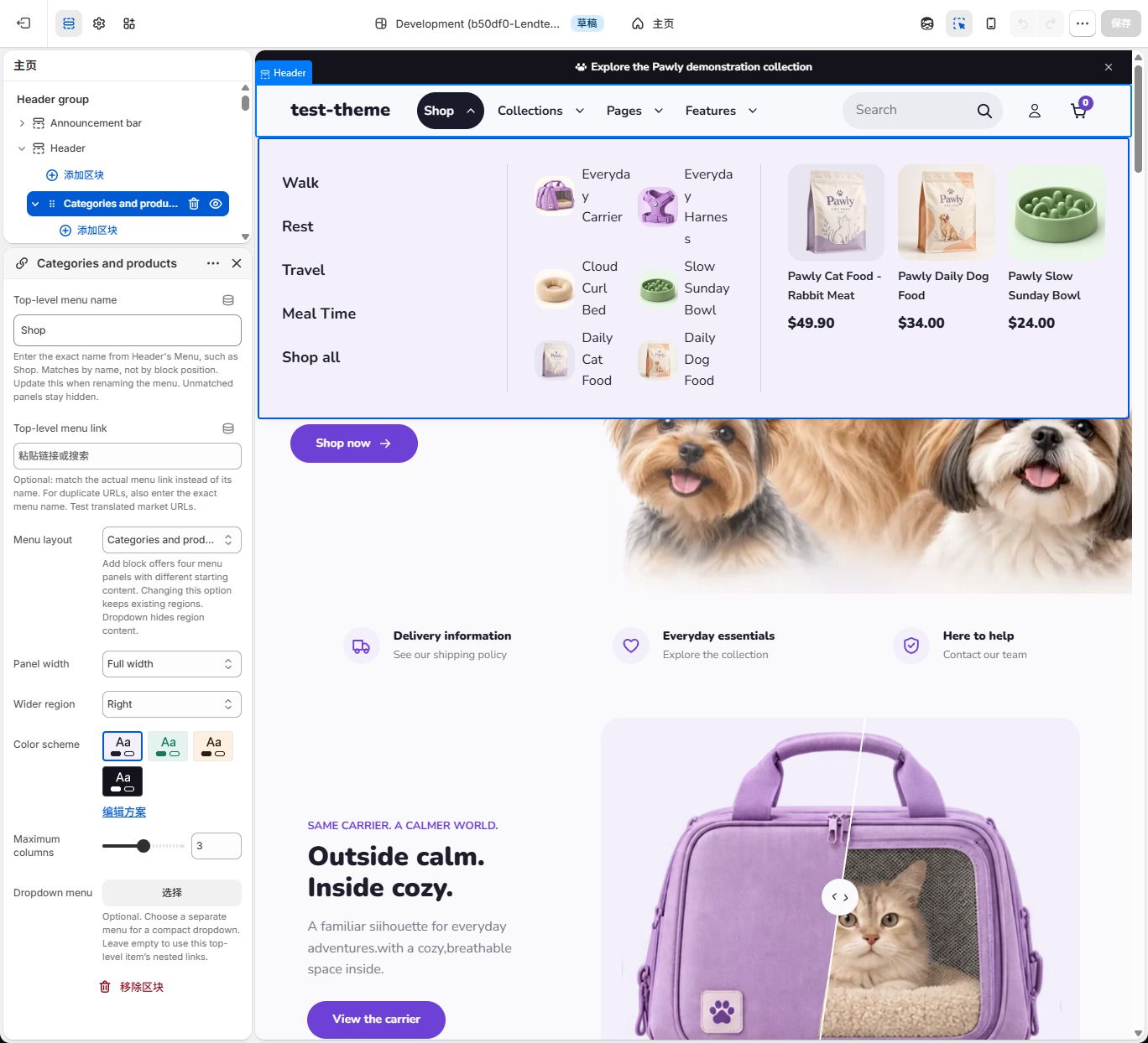
Section titled “Step 1: Add and associate the Shop panel”- Expand Header and select Categories and products from Add block directly inside Header. A panel with that name appears with Left and Right regions already inside it.
- Click the panel name and enter Shop in Top-level menu name, exactly matching the main menu’s Label. Do not enter the admin menu name Pawglade Reference Header here. Leave Top-level menu link empty when matching by name.
- Keep Menu layout = Categories and products. Set Panel width = Full width and Wider region = Right. Choose a suitable Color scheme. The example uses the first scheme; its actual background depends on your theme colors.
- Click Save and open Shop. If the expected content does not appear, check Header → Menu and the exact Shop label first. Panel position in the sidebar does not determine its associated top item.
Step 2: Configure the left category links
Section titled “Step 2: Configure the left category links”- Click the arrow beside Categories and products to expand its children.
- Expand Left and click its included Category navigation content block.
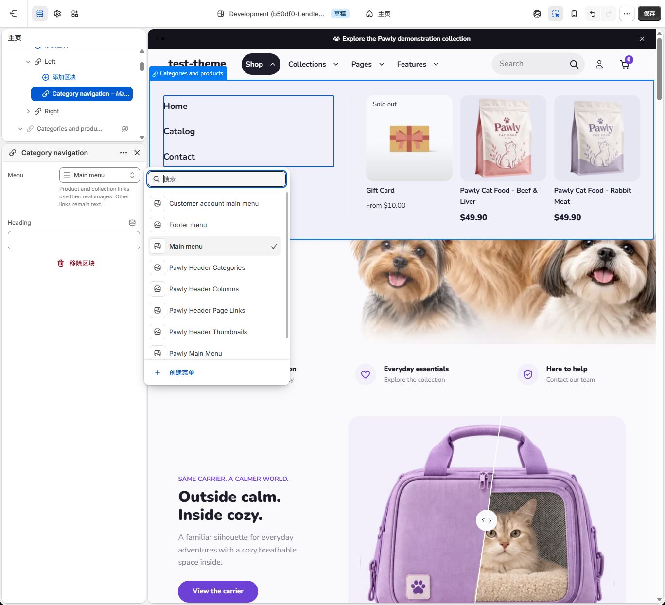
- Set that content block’s Menu = Pawglade Header Categories. Leave Heading empty.
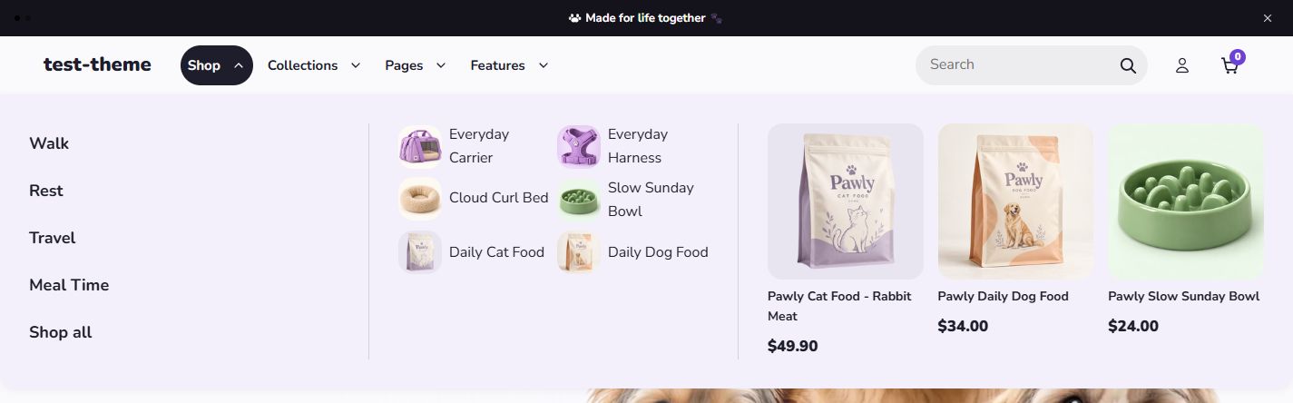
- Save and open Shop. The left side should display Walk, Rest, Travel, Meal Time and Shop all, or your actual category labels.
This is the category block’s own menu. Header’s Menu remains Pawglade Reference Header.
Step 3: Add the center region and thumbnail links
Section titled “Step 3: Add the center region and thumbnail links”- From Add block inside the Categories and products panel, choose Center. This differs from Header’s Add block: a panel accepts regions, and a region accepts content.
- Expand the new Center. It includes Menu text. Click Menu text and choose Remove block at the bottom of its settings. Remove only that starter text, keeping Center.
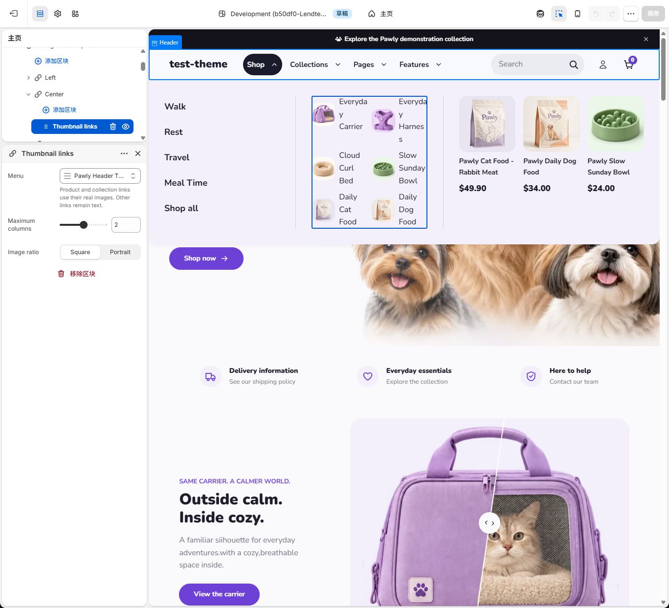
- From Add block inside Center, choose Thumbnail links. Open it and set Menu = Pawglade Header Thumbnails, Maximum columns = 2 and Image ratio = Square.
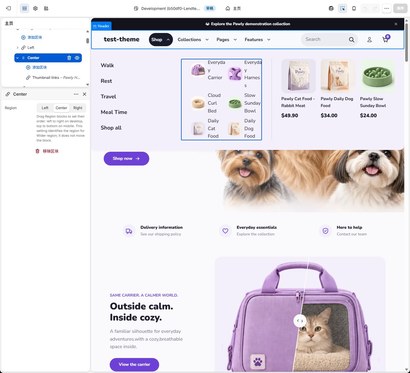
- Center may initially appear at the start or elsewhere in the region list. Drag its handle between Left and Right, keeping all three regions at the same indentation level.
- Click Center and confirm Region = Center. Check that sidebar order is Left → Center → Right. Changing the Region setting does not replace dragging.
- Save and open Shop. The center should show linked product images and labels, in up to two desktop columns. If only text appears, check that the menu links to actual products or collections with images.
Step 4: Select three products on the right
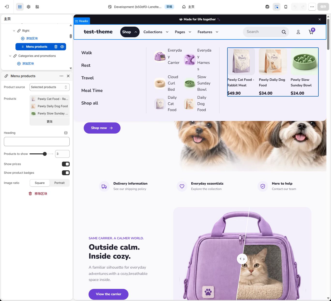
Section titled “Step 4: Select three products on the right”- Expand Right inside the same Shop panel and click Menu products.
- Newly added content normally starts with Product source = All products, which reads actual store products. For this example, change it to Selected products.
- Open the Products selector, select three actual products, then click outside the list to return. The example uses Daily Cat Food, Daily Dog Food and Slow Sunday Bowl; choose your own products. Full product titles in this picker can differ from the short labels you entered in a menu.
- Set Products to show = 3, turn on Show prices and Show product badges, set Image ratio = Square, and leave Heading empty.
- Click Save. Open Shop and confirm that three real products and their prices appear on the right. Badges depend on actual sold-out or sale status, so not every product needs a badge.
Step 5: Check the structure and mobile menu
Section titled “Step 5: Check the structure and mobile menu”The completed sidebar should contain:
- Header
- Categories and products (Top-level menu name = Shop)
- Left (Region = Left) → Category navigation
- Center (Region = Center) → Thumbnail links
- Right (Region = Right) → Menu products
- Categories and products (Top-level menu name = Shop)
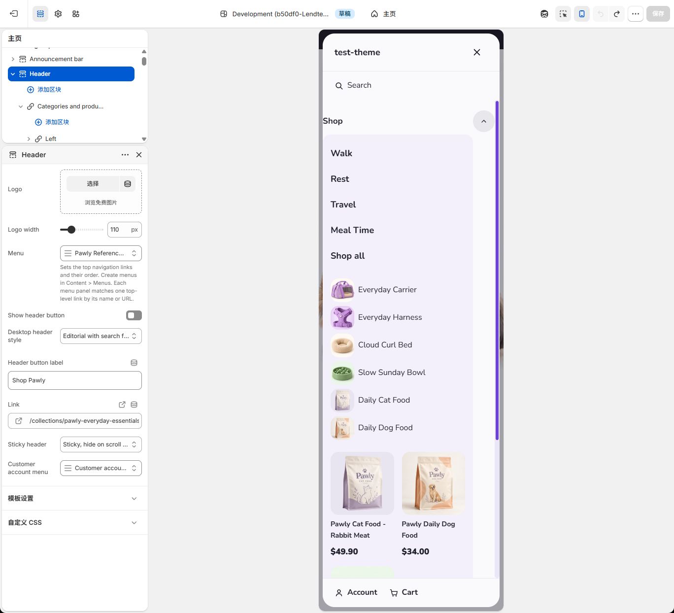
Save, switch to the editor’s mobile preview, open the mobile menu and expand Shop. Regions appear top to bottom in Left → Center → Right order; products can use a different column count. Open the store preview to check the Shop destination, category links and product links, then return to the editor and confirm there are no unsaved changes.
If clicking a menu only selects Header, turn off the inspector icon at the top of the editor before testing the mobile menu. The inspector selects sections rather than testing customer clicks. You can turn it back on afterward.
Settings
Section titled “Settings”Defaults below are the base setting defaults. Added combinations can preselect different content, and an existing theme shows your saved values. Follow the setup values above; you do not need to reset configured values to this table.
Header
Section titled “Header”| Setting | Default | Options | What it does |
|---|---|---|---|
| Logo | Not set | Image | Choose this area’s logo. Without an available logo, the actual store name appears. There is no global Default logo control in the current theme. |
| Logo width | 140 | 60–300; step 10 | Target logo width; it can shrink to fit the phone header. |
| Menu | main-menu | Shopify menu | Choose the top navigation menu. Its top items and order appear in Header; clearing it removes those navigation links. |
| Show header button | On | On / Off | Show the separate desktop header button; this button is not shown on phones. |
| Desktop header style | Standard | Standard / Editorial with search field | Standard uses the regular top bar. Editorial adds a desktop search field, a dark open-menu pill and circular card arrows. |
| Header button label | Book now | Text | Replace the header button text to describe its destination. |
| Link | Not set | Link | Header button destination; empty opens all products. |
| Sticky header | Sticky, hide on scroll down | Not sticky / Always sticky / Sticky, hide on scroll down | Choose no sticky header, always sticky, or hide while scrolling down and show while scrolling up. |
| Customer account menu | customer-account-main-menu | Shopify menu | Menu used by the customer account component; customer accounts must be enabled. |
Blocks
Section titled “Blocks”Add a panel in Header, regions inside the panel, and content inside each region. All levels count toward the 50-block Header limit.
Shared menu panel settings
Section titled “Shared menu panel settings”Add one of the four starting arrangements inside Header. The table lists base defaults; the chosen arrangement selects Menu layout and some starting content.
| Setting | Default | Options | What it does |
|---|---|---|---|
| Top-level menu name | Not set | Text | Copy the exact top-level name from the main menu. Update it after renaming. Enter it once on the panel. |
| Top-level menu link | Not set | Link | Optionally match the actual top-level URL. Also enter the exact name when multiple items share a URL. |
| Menu layout | Categories and promotions | Dropdown / Brand navigation / Categories and products / Categories and promotions | Choose one of four menu arrangements. Dropdown uses links and does not display promotional region content. |
| Panel width | Content width | Content width / Full width | Choose the open panel width; Dropdown remains compact. |
| Wider region | Balanced | Balanced / Left / Center / Right | Give one region more width or balance the regions; check the amount of real content. |
| Color scheme | scheme-1 | Theme color scheme | Use a theme color scheme. Choose a white-background scheme for a white panel and check text contrast. |
| Maximum columns | 3 | 2–4; step 1 | Maximum columns on wider screens; phones rearrange content to fit. |
| Dropdown menu | Not set | Shopify menu | Used by Dropdown only. Empty uses this top-level item’s nested links. Adding Dropdown initially selects main-menu; clear or replace it as needed. |
Region
Section titled “Region”Add Left, Center or Right inside a panel. Each newly added region contains editable Menu text; replace or remove it if not needed.
| Setting | Default | Options | What it does |
|---|---|---|---|
| Region | Left | Left / Center / Right | Choose the region identity used for width balance. Drag the region blocks to set their display order. |
Menu text
Section titled “Menu text”Add inside a region. Starter heading is Explore our store and text is Discover our collections. Edit or clear both as needed.
| Setting | Default | Options | What it does |
|---|---|---|---|
| Heading | Not set | Text | Optional heading; replace or remove any starter text that does not fit your store. |
| Text | Not set | Rich text | Enter your actual brand introduction; clear it to keep only a heading. |
| Button label | Not set | Text | Button text; select Link as well to display the button. |
| Link | Not set | Link | Destination for the text button; also enter Button label to show the button. |
Category navigation
Section titled “Category navigation”Add vertical category links inside a region; choose a menu, usually for the left column.
| Setting | Default | Options | What it does |
|---|---|---|---|
| Menu | main-menu | Shopify menu | Choose a real Shopify menu. Clearing Menu in a content block hides that block; it does not inherit the main menu. |
| Heading | Not set | Text | Optional heading; replace or remove any starter text that does not fit your store. |
Menu columns
Section titled “Menu columns”Add link columns inside a region. Child links appear below their corresponding menu heading.
| Setting | Default | Options | What it does |
|---|---|---|---|
| Menu | main-menu | Shopify menu | Choose a real Shopify menu. Clearing Menu in a content block hides that block; it does not inherit the main menu. |
| Heading | Not set | Text | Optional heading; replace or remove any starter text that does not fit your store. |
Thumbnail links
Section titled “Thumbnail links”Add links with actual product or collection thumbnails inside a region. Ordinary page links remain text.
| Setting | Default | Options | What it does |
|---|---|---|---|
| Menu | main-menu | Shopify menu | Choose a real Shopify menu. Clearing Menu in a content block hides that block; it does not inherit the main menu. |
| Maximum columns | 2 | 1–3; step 1 | Maximum columns on wider screens; phones rearrange content to fit. |
| Image ratio | Square | Square / Portrait | Choose the media crop ratio and check that the subject stays visible. |
Menu image card
Section titled “Menu image card”Add inside a region. Edit the starter heading Explore the collection. Without an image it remains a real text card; no image is generated.
| Setting | Default | Options | What it does |
|---|---|---|---|
| Image | Not set | Image | Choose a real image, at least 800 px wide and matching the selected ratio. A heading without an image displays a text card. |
| Heading | Not set | Text | Optional heading; replace or remove any starter text that does not fit your store. |
| Short label | Not set | Text | Optional short label; this is not an automatic product sale status. |
| Link | Not set | Link | Click destination for the image card; empty makes the card non-clickable. |
| Card style | Below columns | Below columns / Text over image | Below columns places text below the image. Text over image places text on the image. |
| Image ratio | Square | Square / Portrait / Landscape | Choose the media crop ratio and check that the subject stays visible. |
Menu products
Section titled “Menu products”Add inside a region. The base default is Selected products; adding this block or Categories and products starts with All products.
| Setting | Default | Options | What it does |
|---|---|---|---|
| Product source | Selected products | Selected products / All products | Selected products uses your chosen list. All products uses the store’s actual all-products list. Newly added Menu products starts with All products; an empty store does not generate sample products. |
| Products | Not set | Up to 4 products | Used when Product source is Selected products. Choose up to 4 products; clearing the list hides the product block. |
| Heading | Not set | Text | Optional heading; replace or remove any starter text that does not fit your store. |
| Products to show | 3 | 1–4; step 1 | Maximum products displayed, limited by the actual products available. |
| Show prices | On | On / Off | Show actual product prices; products with varying prices show a from price. |
| Show product badges | On | On / Off | Show badges from actual availability and compare-at prices; this does not create a sale price. |
| Image ratio | Square | Square / Portrait | Choose the media crop ratio and check that the subject stays visible. |
Images and content tips
Section titled “Images and content tips”Use image cards at least 800 px wide and keep their crop ratios consistent. Thumbnail links use an actual linked product image or collection image, falling back to that collection’s first product image. Ordinary page links remain text. Menu products uses actual product images, titles, prices and availability.
Good to know
Section titled “Good to know”- Header allows 50 blocks in total, including panels, regions and content. This does not mean 50 complete mega menus.
- The main menu determines top navigation order. A panel matches by name or URL. Dragging determines region order. These are separate rules.
- Add-block preview cards show content on its own. Once added, actual menu matching, open state and selected resources apply. A visible preview card does not prove the panel is associated with Shop.
- Changing Menu layout keeps existing children. Dropdown uses links and hides region content. To start with another combination, add it and move the required content without retaining duplicate matching panels.
- Without usable panel content, the theme uses the top item’s own nested links. With neither children nor usable panel content, there is nothing to expand.
- Desktop supports hover, click and keyboard expansion; Escape closes the open layer. Mobile uses the navigation drawer. The outside has no purple border; Color scheme still controls its background.
Example setups
Section titled “Example setups”Collections: link columns and two image cards
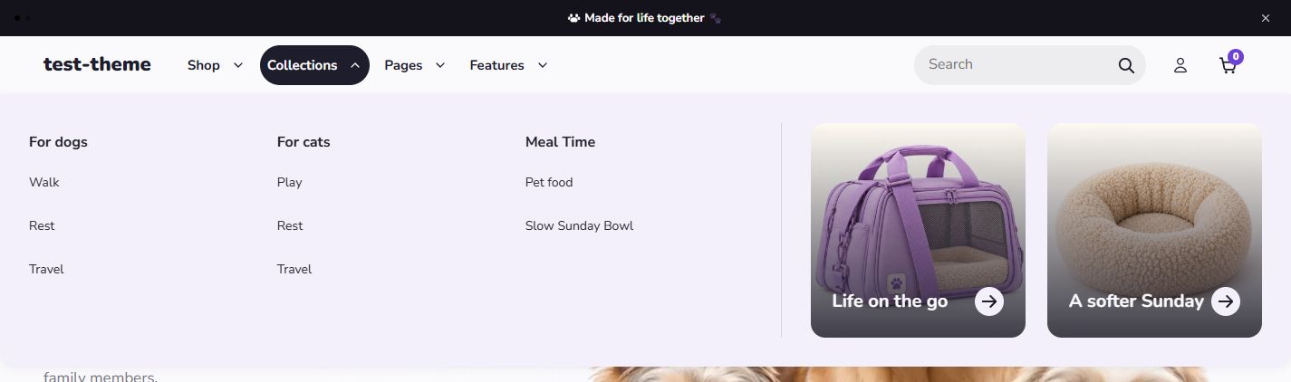
Section titled “Collections: link columns and two image cards”- From Header’s Add block, choose Categories and promotions. Open it and set Top-level menu name = Collections, Panel width = Full width, Wider region = Left and Maximum columns = 3.
- Expand Left → Menu columns and select the saved Pawglade Header Columns in its Menu. Top-level items in that menu become column headings and their children become links below them. You do not add three more Region blocks.
- Expand Right → Menu image card. Use Image to choose or upload a real image, confirm it and return to the block settings. The first example uses a carrier image, Heading = Life on the go and the Travel collection as Link.
- Set Card style = Text over image, Image ratio = Square, and leave Short label empty.
- From Add block inside Right, add another Menu image card. Choose a bed image, Heading = A softer Sunday and the Rest collection as Link. Apply the same style and ratio.
- Confirm that the panel has Left → Right, with two image cards inside Right. Save and open Collections. Check the images and text on mobile too.
Pages: brand text, three cards and page links
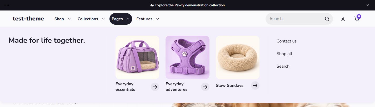
Section titled “Pages: brand text, three cards and page links”- From Header’s Add block, choose Brand navigation. Set Top-level menu name = Pages, Panel width = Full width and Wider region = Center.
- Expand Left → Menu text. Set Heading = Made for life together. and clear Text to keep only the heading. Clear the text field rather than deleting Left.
- Expand Center → Menu image card. Choose its image, enter its heading and choose a link. Set Card style = Below columns and Image ratio = Square.
- From Add block inside Center, add two more Menu image card blocks. Set Image, Heading, Link and the same style for each. Example headings are Everyday essentials, Everyday adventures and Slow Sundays, linked to the Everyday Essentials, Walk and Rest collections respectively. Images show a carrier, harness and bed. Select your own equivalent resources when these example collections are unavailable.
- From Add block inside Brand navigation, choose Right. Expand it and remove the included Menu text, keeping the region itself.
- From Add block inside Right, choose Menu columns and set its Menu = Pawglade Header Page Links.
- Drag regions into Left → Center → Right order. Save and open Pages. Confirm three center cards and the page links on the right. Mobile displays regions vertically in that order.
Features: compact nested navigation
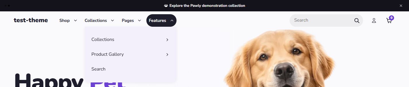
Section titled “Features: compact nested navigation”- Open the Pawglade Reference Header main menu and confirm that Features contains Collections, Product Gallery and Search, with their intended children. Save any menu changes on that page.
- Return to the theme editor. From Header’s Add block, choose Dropdown and set Top-level menu name = Features.
- Dropdown menu can initially select Main menu. Open that selection and remove or clear it. Leaving it empty uses Features’ own nested links from the main menu.
- Do not add Left, Center, Right or image cards to this layout. Save and open Features. Collections and Product Gallery expand because they have children; Search opens directly.
Common questions
Section titled “Common questions”Why can’t I find Mega menu layout? Current add options use the four specific combinations, and added panels use the same names. An older instance may show Mega menu layout, the generic panel name. Identify it through Top-level menu name and Menu layout. Do not search for it under Add section.
Why does my Shop panel not appear under Shop? Check these in order: Header → Menu selects the correct main menu; the main menu’s Label is Shop; Top-level menu name matches exactly; Top-level menu link does not contain a conflicting target; an earlier panel does not already match Shop; regions contain actual content. Save your changes.
Why didn’t setting Region to Right move it? Region identifies it for styling. Drag the region to change its position, then check that Wider region targets the intended identity. Mobile follows the dragged order from top to bottom.
Why do categories show Home / Catalog / Contact? The content still selects Main menu. Open the content block’s own Menu and choose the intended category, columns or thumbnail menu. Changing Header’s Menu alone does not change those sources.
Why are thumbnail images or products missing? Thumbnails need actual product or collection resources with images; ordinary links can remain text. Selected products needs a chosen product list, while All products needs available products in the store. Check resources and sales-channel availability before the count settings. Empty resources do not generate invented images or products.
What should I update after renaming or reordering a menu? After changing a top-level Label in Content → Menus, update its panel’s Top-level menu name. Reordering top items does not require reordering panels. Drag regions inside a panel to change their left-to-right order.
What if the editor and store look different? Save both the menu page and theme editor. Check that you opened the same theme preview and have exited the add-block preview card. Then check desktop/mobile mode, the actual open menu, selected resources and colors. A standalone preview card does not prove the final menu association is correct.